Let’s face it. For many of us our website is our shopfront.
They can showcase your products and services, feature your promotions, as well as answer the deepest concerns of your website visitors and existing customers.
And they do this 24/7!
But, how many of us actually look at our website from a customer perspective?
How good is the user experience?
I’m asking these questions as I have found myself frustrated on a few websites lately.
Some of the issues have included:
- Having to follow the breadcrumbs to find what I’m looking for
- Buttons that don’t work
- Links that go to the wrong destination
- Marketing images that link to something unrelated or completely different
- Social media posts that don’t link the promise that appeared to offer
- Inconsistent and confusing terminology
- Directing me to horrible content that is neither appealing or compelling
- Shopping links that take me to completely unrelated products
- Broken links and 404 errors
 Quite frankly, some websites are HARD WORK!!! It doesn’t matter how amazing the content is, if you make it hard for me to find, I’m going to miss it!!
That means poorer results for your efforts.
Now I admit. It’s a challenge for all of us as business owners, myself included. But if you aren’t seeing the results you want from your marketing and promotions, take a look at your website from a customer point of view.
Also, remember it must function smoothly on mobile devices, part of Google’s ranking algorithm.
It matters, and can directly impact your bottom line.
So, what makes good website navigation?
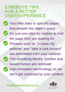
- You offer links to specific pages that answer the client’s query
- It’s just one click for visitors to find the page they are looking for
- Phrases such as “browse my website” and “take a look around” are eliminated from your website vocabulary
- The stumbling blocks, hurdles and speed humps that block a smooth path from place to the next are removed
- Use consistent terminology so we know what you’re referring to
- Remove old links that are no longer valid
I know considering these issues might seem overwhelming, but the last person you want to overwhelm is your customer!!
Just step back, and experience your site through fresh eyes, or have someone do it for you.
It will be worth it to take the pressure of your customer and make it easy for them to consume your products, services, and offerings.
What else do you find frustrating when you are on other business websites?
[thrive_link color=’green’ link=’https://www.facebook.com/groups/healthymarketing/’ target=’_self’ size=’medium’ align=’aligncenter’]Join the HEALTHY MARKETING ACADEMY Facebook Group[/thrive_link]

